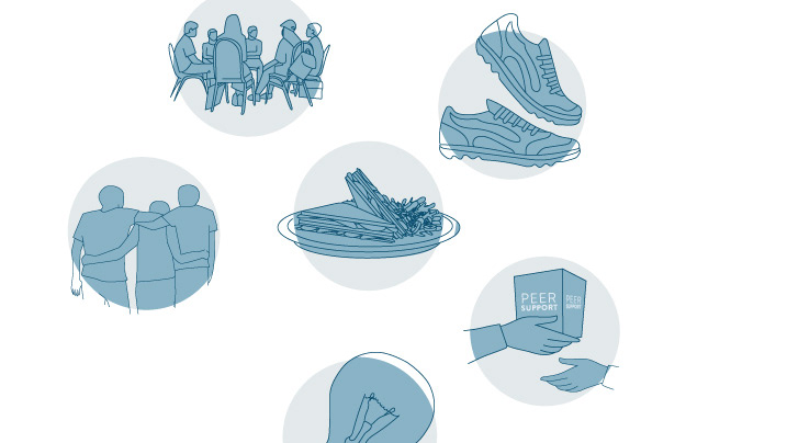
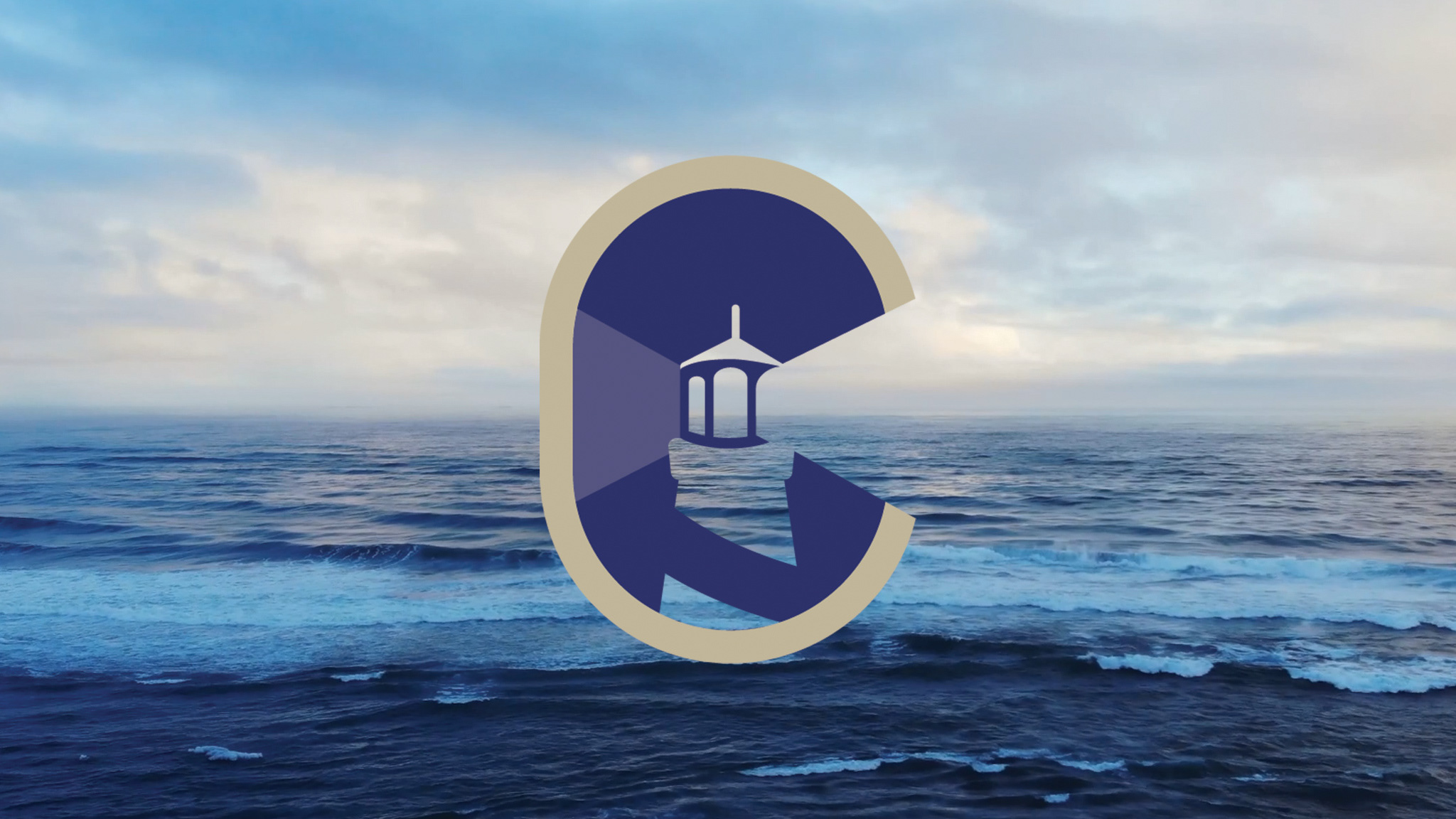
Coast Mental Health Work
2023
Bad Cookie Pictures Cryptid Tshirt Designs
2023
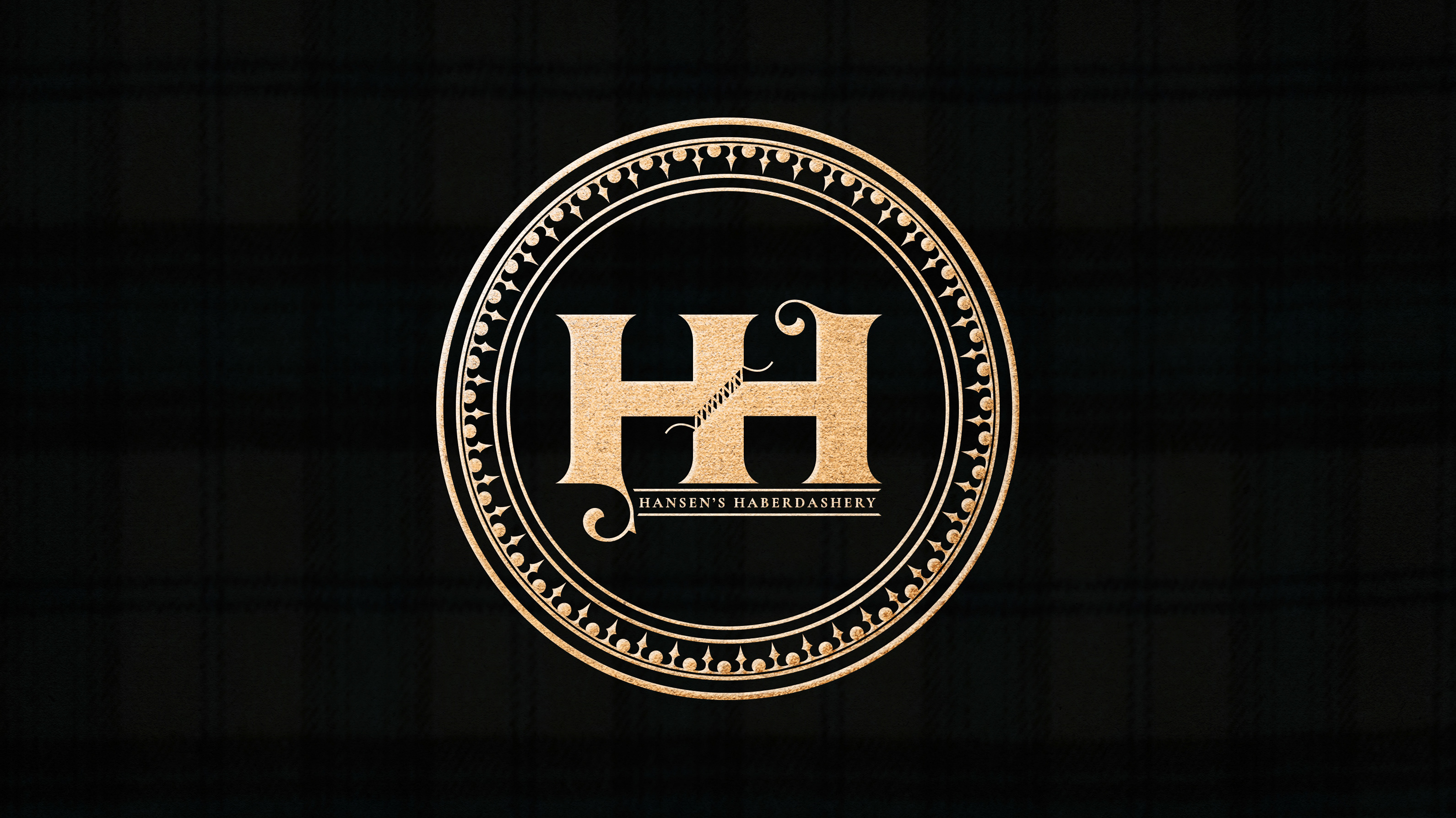
Hansen's Haberdashery
2023
Dr Sukhi Materials
2023
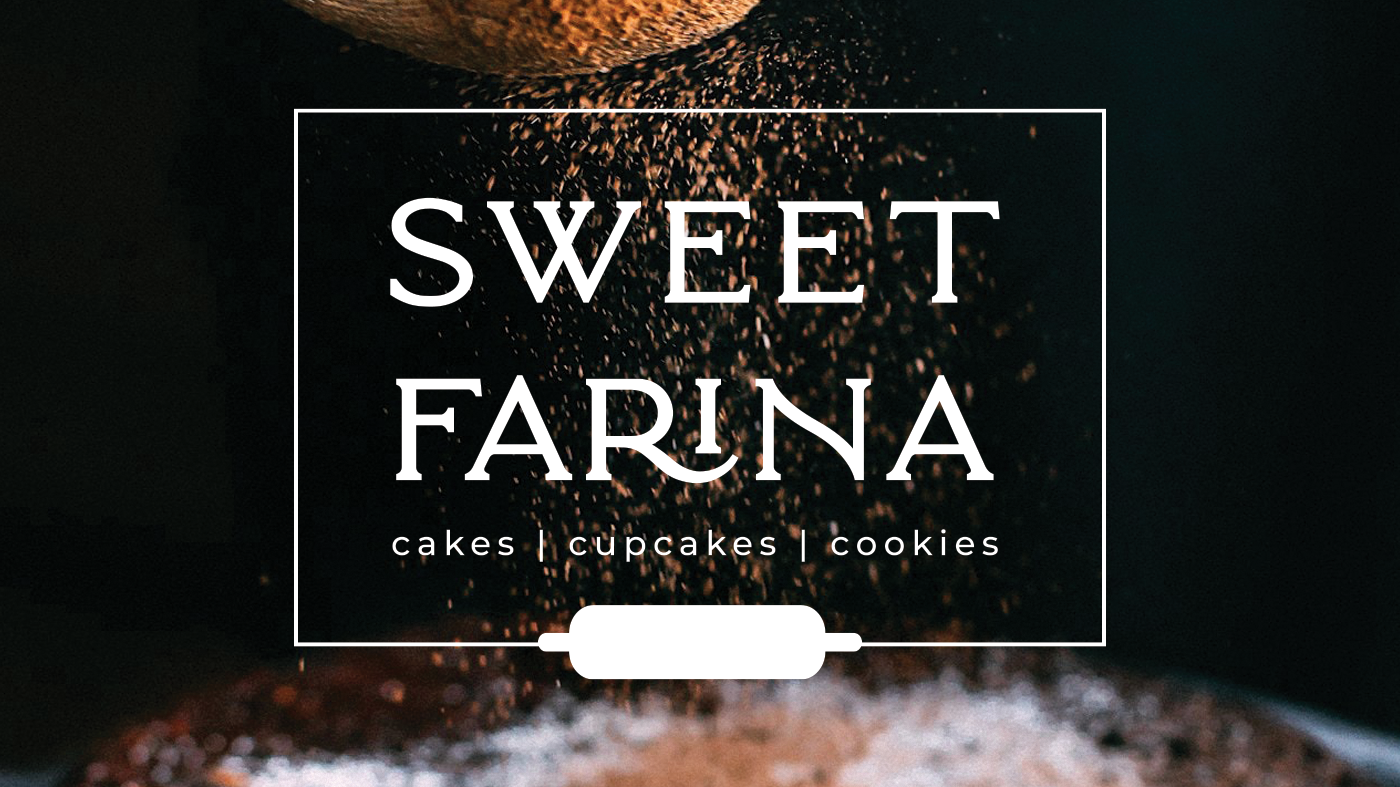
Sweet Farina
2023
Charterhouse Prime Investments
2023
Global Dec-k-ing Projects
2022

Adrienne Danielson Coaching
2022

Various Maximizer items
2019
Resilience Nutrition
2019
BIRCH + FOG
2017
Pairachute
2017
Canna Co Medibles
2018
The Biggest Branding Mistakes Book
2016
Village Books
2016